Here some of the Frequently Asked Questions I get about my BotanINK Series prints:

What are Giclée Prints? How do you make them? Giclée prints are high quality digital prints that use professional inkjet printers. For mine I use an 8 color HP large-format printer, with fade-resistant, archival HP Vivera inks printed in fine art EPSON somerset velvet or Watercolor paper. The original BotanINK paintings these prints are based on are all Mixed Media (Acrylics base or Encaustic base with Collage, inks, pastels, oils pastels, metallic paint, encaustic paint, crayons, carving, etc.)
Why digital prints for BotanINK? For my BotanINK series color, texture and layers are key elements. The digital printing process of a giclée simply provides better accuracy than other media for what I wanted to create in this series. I love and embrace technology and like to try things when they make sense. Each original painting of this series has been very detailed and labor intensive, which makes them not-so-affordable… I see these prints as a great way to make the artwork with some of the rich key elements of the paintings (color, texture and layers) and some elements unique to prints (color studies) more affordable.
But, they don’t look like prints… I spent some time researching the best material and process to use without compromising on quality. I only print from sharp high resolution images, using the best paper and inks I could find. The designer in me recognizes the importance of presentation. Traditional frames for prints can be wonderful and I use them too, but I learned that the glass between the print and the person takes away a lot of the richness gained with a good printer, best paper and expensive pigments. So I decided to offer an alternative to traditional mats and frames. On one hand, using a display system that takes the glass and its glossiness completely away, there are block mounted prints, ready to hang without glass to help us appreciate the texture and depth of the prints without separation. My matted prints w/ink drawing, on the other hand, are meant to enhance that separation showing a unique one-of-a-kind mat that “grows” out of the the print organically into it surroundings.
Why Change? I learned in my profesional life, regardless of the disciplines I have worked on, I have found we are different and we like to change. Like my son says when I try to persuade him : me: I love to eat vegetables, he: We all have different taste buds, Mom… So, I learned to provide options (with limitations, of course). I find fascinating how we each react differently to the things in front of us. This used to frustrate me during college, but I embrace it now. Artwork that adapts is, in a way, an expresion of our time. We are all different, we all adapt. In the future I aim to tap this further with installations and removing my own judgement more, but these studies are a starting point.
Botanical studies in print: Maybe you have noticed I like to experiment altering the color and sometimes details of some of my botanINK paintings when I make prints out of them. This is a conscious decision that comes from an acknowledgment that a piece is only complete when somebody other than the painter is experiencing it. The viewer’s perspective is key: I love to alter variable elements such as color, scale, size and details, and let people react to them in different ways. Even over time, the reactions change. 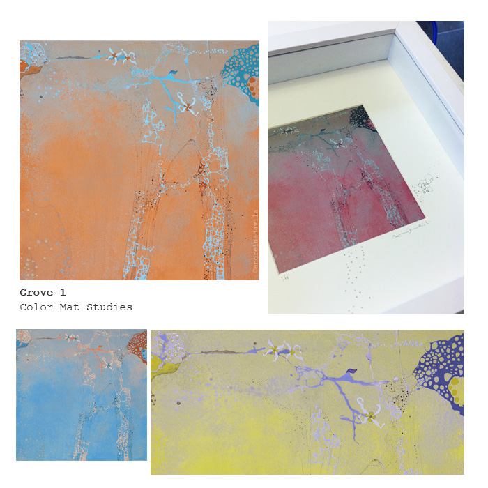
Hand-painted Details: Sometimes I draw by hand on BotanINK prints to add a special detail that the giclée process did not get or to create different studies and see the piece evolve into something new. The hand-touched pieces have the same price as the other ones: to me it is not a gimmick, but rather a way to experiment with the series.

Smaller Editions: On my newer prints I decided to make smaller editions, so you will see editions of 15, 20, or 25 prints. For older prints like After the Fire (Editions of 100) or Orbits (Editions of 50) I decided to currently print only up to 25 to keep my inventory fresh and make room for new work.
How does the 3D work? Technically, the glasses that come with the BotanINK prints and paintings use the ChromaDepth 3D system that produces an illusion of depth based upon differences of color through a special prism-like holographic film fitted into the glasses. Any 2D media piece can be given a 3D effect with the use of these glasses as long as the color spectrum contrasts warm colors against cool colors, (red on top of blue, for example, to give a deeper effect). However, with my color studies changing the color of the composition I have been experimenting with color combinations with interesting results.
Why 3D is important in your work? I never get this question, but it is a good one: Chromadepth glasses purposely exacerbate chromatic aberration, which is a is a type of distortion in which there is a “failure” of the eye to focus all colors to the same convergence point, giving the illusion of colors taking up different positions in space. In my work, specially the BotanINK series, where the use of contrasting colors and layers of texture are key composition elements, I find it fascinating how the use of the glasses takes us to another perspective, instantly immersing us in a state that makes us wonder what else is out there that we cannot see or feel because of the limitations of our own body and mind. As my work evolves, I plan to learn and experiment more with this technology, using it for immersive installations as well.
Where can I buy the prints? As of March 2013, you can see and buy BotanINK prints at The Compound Gallery in Oakland ( Special Collection & Print Lounge) and at Secession Art & Design in San Francisco. . Also, you are welcome to visit my studio anytime and see what I have available in prints and originals. Please schedule a studio visit.
Please, feel free to contact me if you have any other questions. Read BotanINK Statement here.
Thanks!